


blue pie news

Fonts have been changing ever since Gutenberg invented the printing press. We all use them every day without knowing which fonts are best suited to each purpose. There are so many to choose from, so here is some trivia about the most commonly used typefaces to help you decide.
Futura was released in 1927, inspired by the font Bauhaus. It can be seen on the plaque on the moon left by the Apollo 11 crew, in the title sequence of the television show Lost and on the Absolut Vodka logo.
Helvetica is a simple font that can be, and has been, used in almost any situation. You can find it in the logos of Microsoft, American Airlines, Target, Sears, Toyota, Tupperware, Staples, Panasonic and American Apparel.
ClearviewHwy was developed in 2004 for highway signs. The reason for the change from Highway Gothic to ClearviewHwy was to decrease the glare from headlights. Putting more space in the interiors of the letters does this.
Arial is almost exactly the same as Helevetica except that the letters in Arial cut diagonally as opposed to stopping vertically. Arial has been used in Microsoft products since 1992.
Courier, originally called Messenger, was designed by IBM in 1955 for their typewriters. The designer, Howard Kettler, said that Courier “radiates dignity, prestige and stability.”
Retina is used in The Wall Street Journal’s stock pages because it can be read at the tiny 5-point size. It was designed to appear bigger than it actually is by cutting notches into the intersections of lines.
Comic Sans is possibly the most hated of all fonts. It was originally designed in 1994 for Microsoft’s desktop cartoon characters. Even the creator admits, “If you love it, you don’t know much about typography.”
So keep this in mind when designing your artwork and documents.
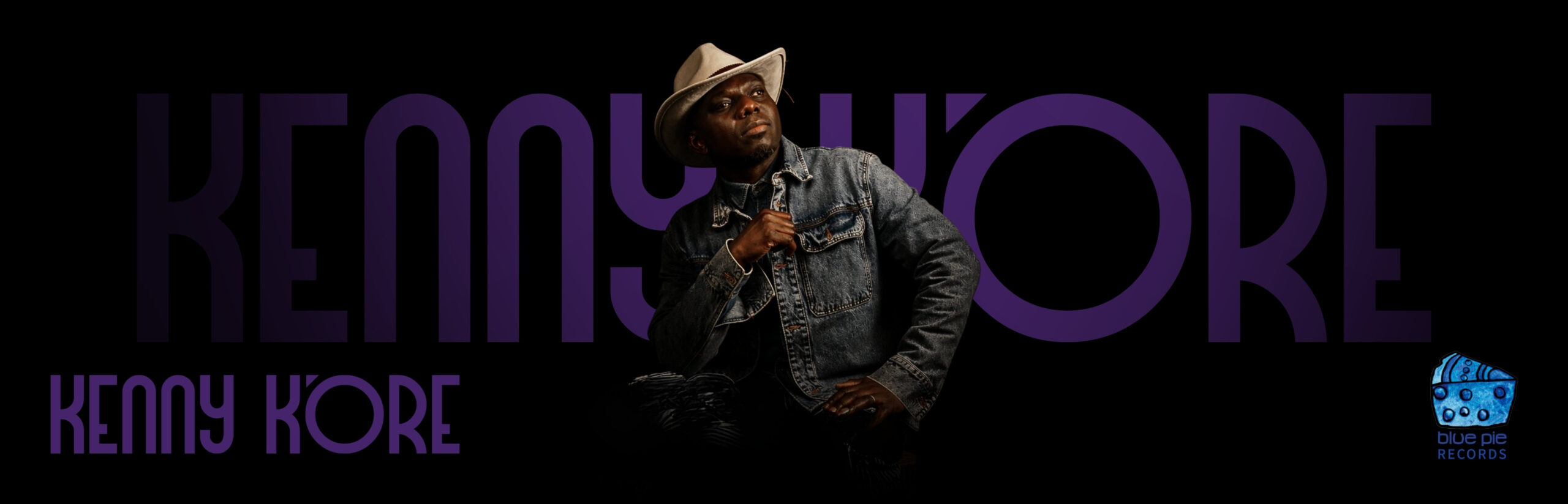
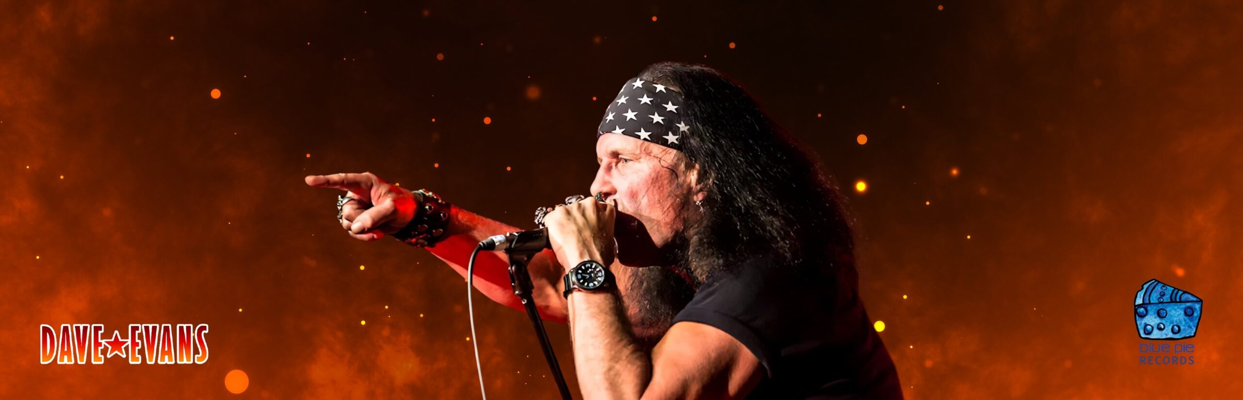
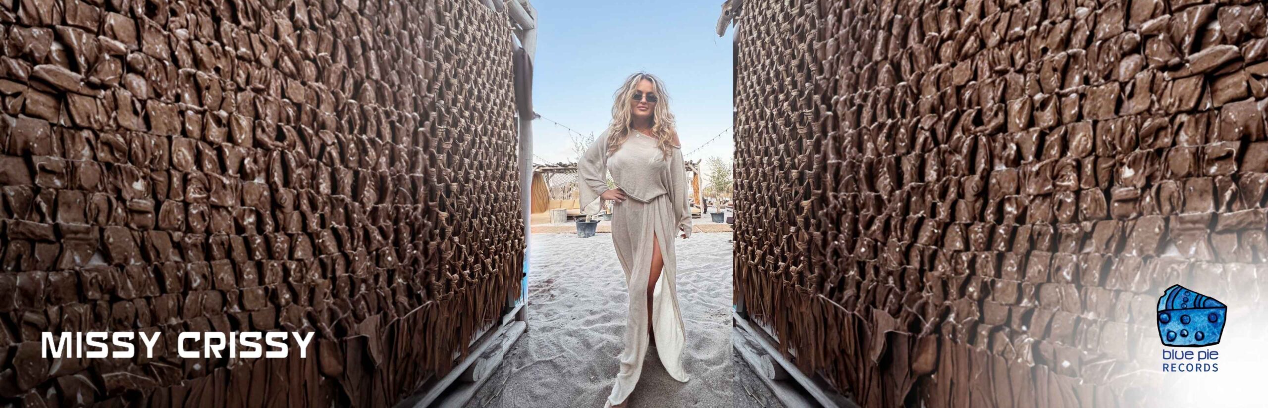
new releases


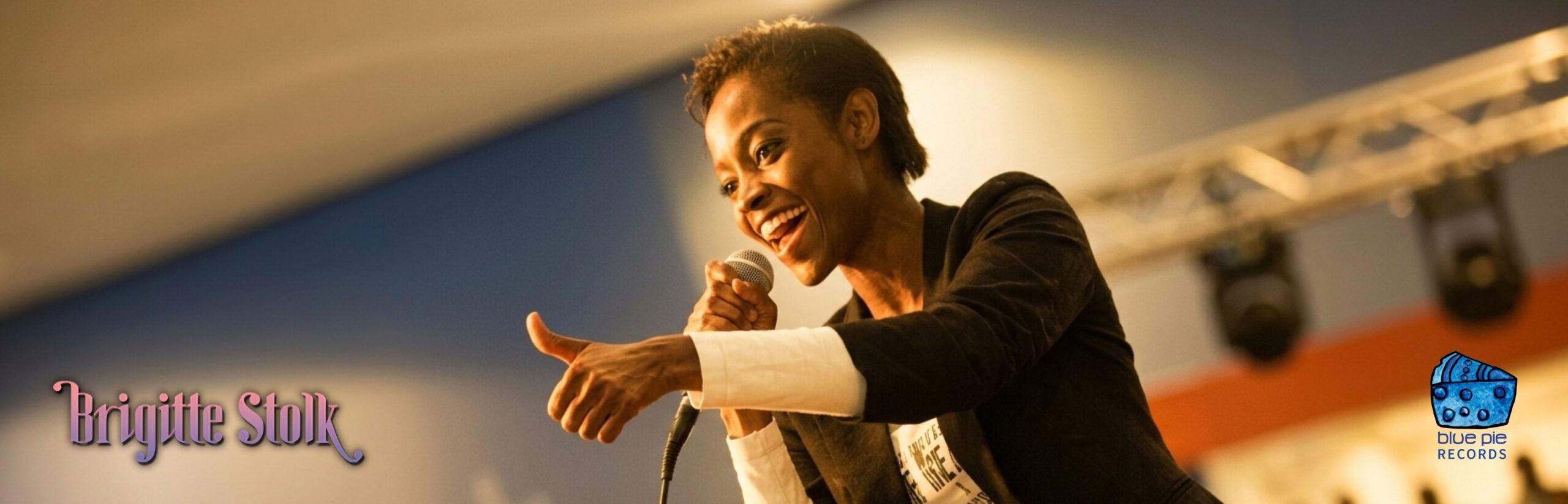
media


blue pie news